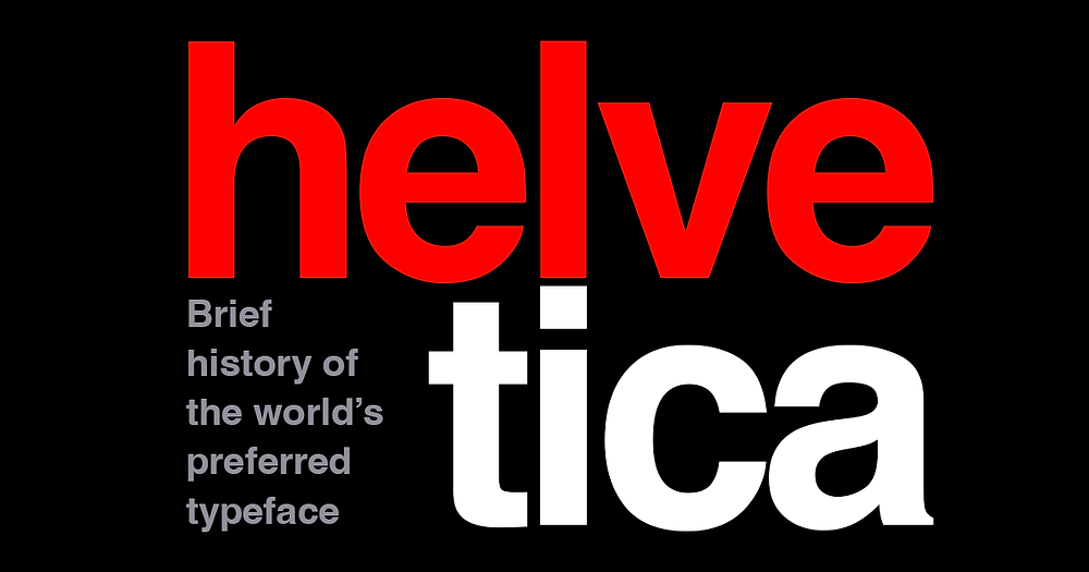
You’ve likely encountered it countless times without even realizing it. It’s on street signs, corporate logos, and even the user interface of your smartphone. This ubiquitous typeface is none other than Helvetica, a classic and widely used sans-serif typeface. This blog post delves into the fascinating history of Helvetica, its origins, its impact on design, and its enduring legacy.
Helvetica was born in the mid-20th century, during a period when Swiss graphic design and the modernist movement were on the rise. Designers were seeking clarity, simplicity, and functionality in their work, steering away from the ornate and decorative styles of the past.
Enter Max Miedinger and Eduard Hoffmann, the masterminds behind Helvetica.
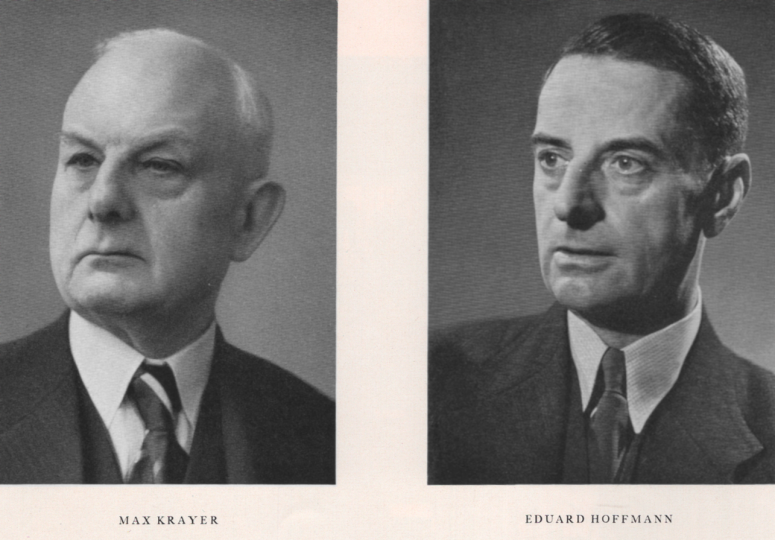
In 1957, under the commission of the Haas Type Foundry in Münchenstein, Switzerland, they created a typeface that embodied the modernist principles of clarity, simplicity, and neutrality. Originally called “Neue Haas Grotesk,” it was later renamed Helvetica, derived from “Helvetia,” the Latin name for Switzerland, to give it a more universal and marketable appeal.
Helvetica’s design is rooted in key modernist principles.
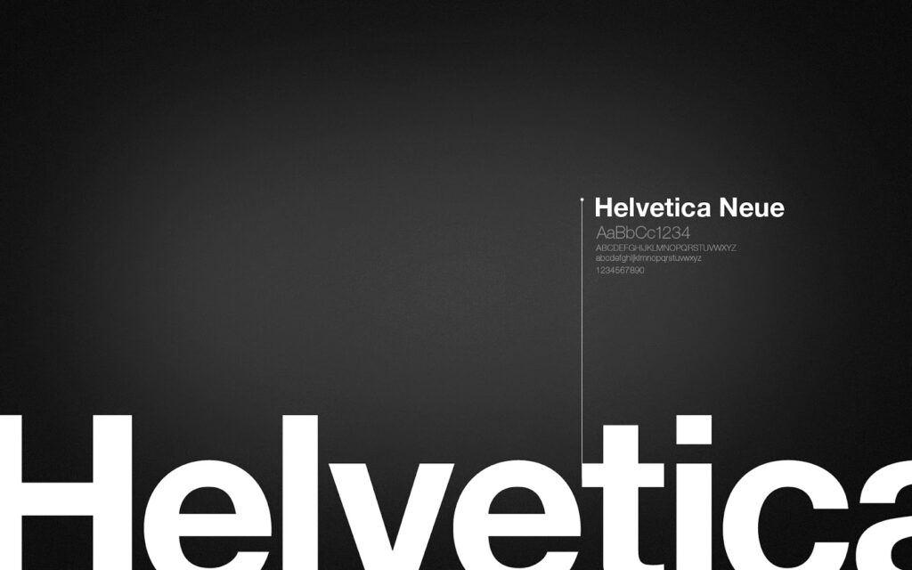
Its clean lines, balanced proportions, and lack of decorative flourishes make it a paragon of modernist design. The typeface’s x-height—the height of the lowercase letters—is relatively high, contributing to its excellent readability. Its smooth curves and consistent stroke widths exude a sense of harmony and balance, making it both functional and aesthetically pleasing.
Upon its release, Helvetica received a warm reception in the design community. It was praised for its clarity, simplicity, and versatility, quickly gaining traction among designers. Its neutrality allowed it to be used across a wide range of applications, from corporate branding to public signage.

Helvetica became synonymous with the “Swiss Style” of graphic design, which emphasized cleanliness, readability, and objectivity. This style resonated with many designers, further boosting Helvetica’s popularity.

Major corporations soon took notice of Helvetica’s versatility and legibility. Companies like Apple, American Airlines, BMW, and Panasonic adopted Helvetica for their branding, cementing its status as a go-to typeface for corporate identity. Its ability to convey professionalism, modernity, and neutrality made it a natural choice for businesses seeking a clean and timeless visual identity.
Over time, Helvetica transcended its role as a mere typeface. It became a cultural symbol of modernity, efficiency, and corporate identity. Its omnipresence in everyday life—on street signs, advertisements, and digital interfaces—is a testament to its enduring appeal. The release of the documentary Helvetica in 2007 further solidified its status as a design icon, offering insights into its history and influence.
While Helvetica is celebrated for its versatility and legibility, it has also faced criticism for its overuse and perceived lack of personality. Some designers argue that its neutrality, while a strength, can also be a weakness, leading to a sense of visual monotony.
This term refers to the over-reliance on Helvetica, which can result in a lack of visual diversity. Critics argue that designers should explore other typefaces to avoid this pitfall and to foster greater creativity and innovation in their work.
Despite the criticism, Helvetica continues to influence contemporary design. Its principles of clarity, simplicity, and neutrality remain relevant in today’s design landscape. It serves as a benchmark for typeface design and a source of inspiration for designers worldwide.
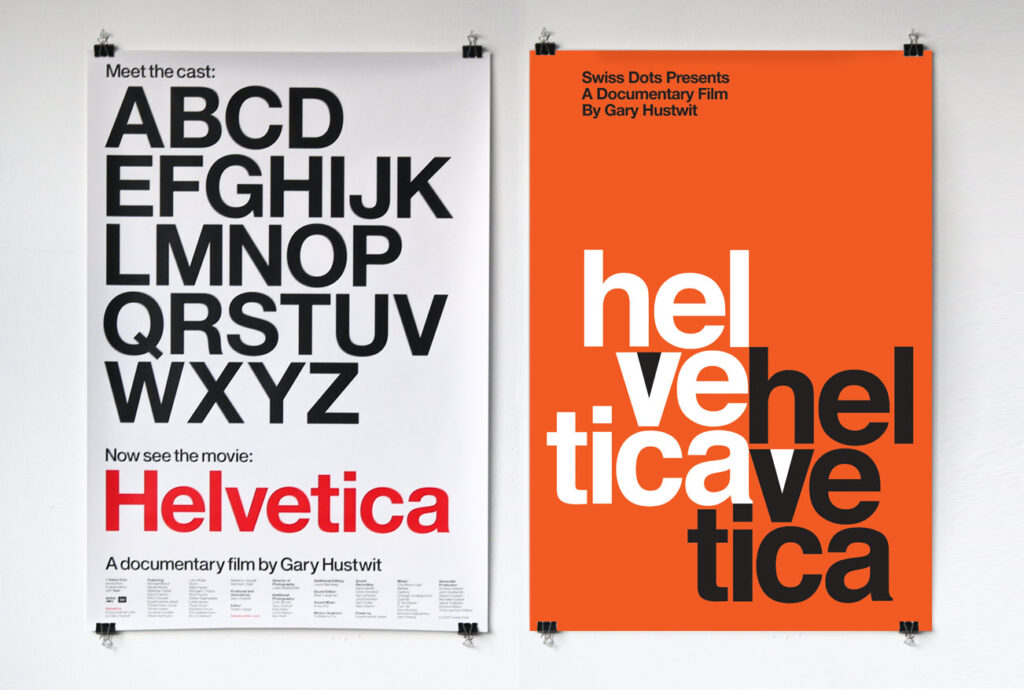
Over the years, Helvetica has evolved to include variations like Helvetica Neue and Helvetica Now. These updated versions offer refinements and expanded character sets, ensuring the typeface’s relevance in an ever-changing digital world.
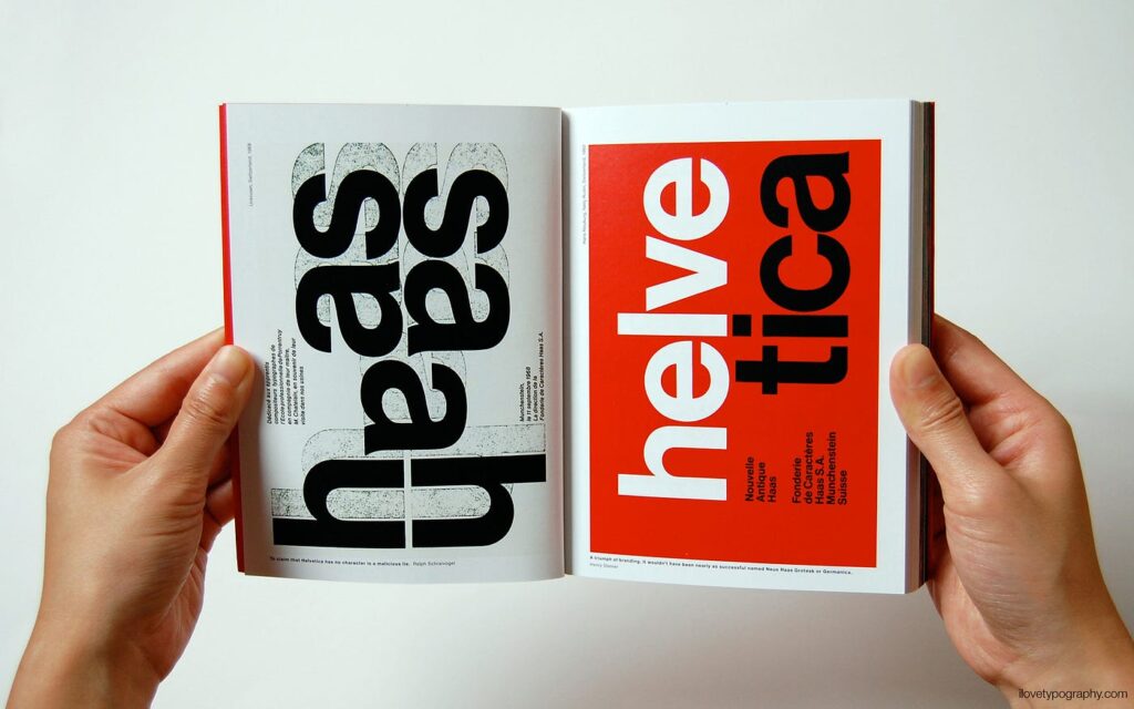
Helvetica is undeniably a landmark achievement in typography. Its enduring impact on the visual world and its status as a design icon are testaments to its significance. Few typefaces have achieved the level of ubiquity and influence that Helvetica enjoys.
Helvetica’s journey from its origins in the mid-20th century to its current status as a design icon is a testament to its timeless appeal. Its principles of clarity, simplicity, and neutrality have left an indelible mark on the world of design. Whether celebrated or criticized, its influence cannot be overstated.
As a designer, Helvetica’s impact on my own design preferences cannot be overstated. Its legacy continues to inspire and shape the visual world around us. The next time you encounter Helvetica in the wild, take a moment to appreciate the craftsmanship and philosophy behind this remarkable typeface.

